Daarken Interview
Welcome to our Artist Interviews series – There’s no Magic without art – where we talk to artists about their work on Magic: the Gathering.
For our first interview, we had the pleasure of talking to Mike “Daarken” Lim, who has been creating amazing art for Wizards of the Coast for over a decade, and here is what he told us.

You’ve been working with Wizards of the Coast for eleven years now. Tell us a little about how you got started and your first work on Future Sight.
Has it already been that long? Now I feel old. I went to the Academy of Art University in San Francisco and graduated cum laude with a BFA in traditional illustration. Right after school I sent out some mailers, again, I’m showing my age. Back then we snail-mailed physical copies of our portfolio. I didn’t hear back from anyone, so I wasn’t really sure what else to do.
I sat around and played video games for about three months and then one day I received a call from Wizards, asking if I wanted to work on D&D. After about two years I asked my Art Director (AD) if I could start doing Magic cards and they said yes. Korlash was one of my first paintings for Magic.
It was definitely intimidating working on Magic for the first time, especially since my AD hooked me up with a sweet card like Korlash.
Jeremy Jarvis, Franchise Creative Director for WotC, said that “the size and format of the medium are not openly conducive to communicating an awe-inspiring sense of immersion”. In which way does the small card format condition the creative process, and how do you work around it?
At first, I focused mainly on the figures or the action of the card and left everything else pretty empty. Most of the time my figures were against an abstract background or some simple landscape, which worked well for the cards, but not so much for prints and posters.
Once WotC started printing my paintings larger, I decided I needed to tighten them up and focus more on the illustration as a whole. These days I just try to create a good painting and I don’t worry too much about details that won’t be seen in print size.
Art descriptions give artists a brief rundown of a card, they must use their imagination and bring it to life. Would you share with us some of the most challenging commissions?
Pretty much all of my early work, haha. I think throwing up my arms and lamenting “I don’t know how to do this” was a common occurrence. There are a few that come to mind though. For some reason, I had a really hard time with Praetor’s Counsel. I used to have a really hard time with color, and I remember having a hard time with the color on that one. I probably went through several different attempts. Even the characters were giving me trouble.

Demonic Tutor was another early piece that I had trouble with. I think figuring out the staging was hard and I’m not very good at painting interiors, so that also caused a problem.
Sarkhan Vol was difficult but in a different sense. The pressure of being the first artist besides Aleksi to paint a Planeswalker definitely got to me. Now I cringe at my original Sarkhan Vol.
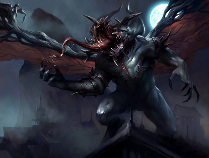
You’ve mentioned that “gross and scary” themes really play to your strengths as an artist. Do you feel more comfortable working within this genre, or can it be equally challenging?
Yeah, I think so. It’s easy to make something gross or scary, but it’s hard making something beautiful. I enjoy doing other genres as well, but I think gross and scary are what people think about when discussing my art.
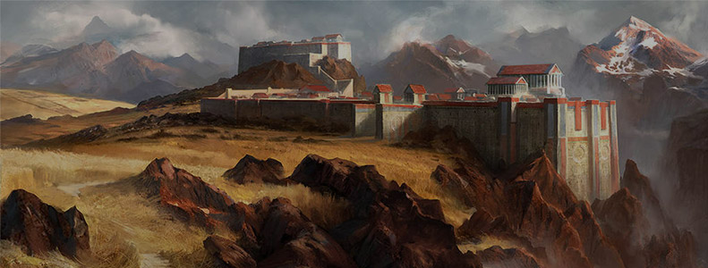
I also read on your blog that painting buildings and crowds are not your cup of tea. How do you venture outside your comfort zone, considering the tight delivery schedules?
I don’t have a choice, haha. Seriously though, a good AD knows how and when to push an artist outside of their comfort zone.
Receiving commissions outside of my comfort zone allows me to broaden my toolbox. If I constantly stayed away from things that were hard or that I wasn’t good at, I would never improve.
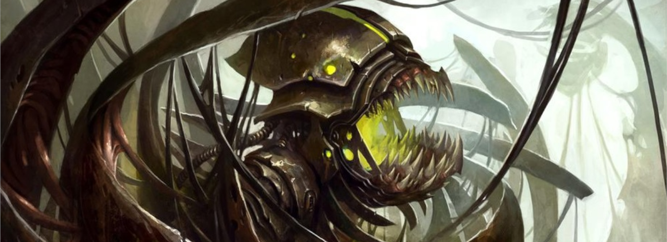
Birthing Pod, Bloodghast, Bloodstained Mire, and Ravenous Chupacabra are amongst some of your well-known cards. You mentioned that “the more you hate a painting, the more players like the card, and vice versa”. Do you believe artists and players value different aspects when it comes to art?
Hah. I don’t think it’s so much that the players value something different when it comes to art, I think it’s just the luck of the draw regarding how playable the card is. I think most of the time players recognize good art on bad cards, and vice versa. I think it’s just interesting that the playability of a card usually has a direct correlation to print and proof sales.
You’ve been doing concept pushes since Innistrad, can you give us a peek behind the curtain about what goes on during the development of the visual identity and overall atmosphere of a set?
Pushes are usually three weeks long. On the first day, we have a meeting where we are presented with the world we need to bring to life. For the first week we are free to explore anything that tickles our fancy. If the part about space vampire gnomes ( Daarken) sounded awesome, then feel free to work on them. WotC is really good about giving the artists freedom.

During the second week, we begin to hone in on the look and style of the world. We are still free to tackle any task in the brief, but we have a little more direction.
The last week has more structure. Each artist is assigned specific tasks that still need to be ironed out. Sometimes everyone will work on the same task if it’s a tricky one. At one point every artist was working on merfolk during the Ixalan push, and we still didn’t have them nailed down after three weeks.
For our last question, of all the cards you’ve made, which one is your favorite and why?
I think right now Balduvian Horde and Gonti, Lord of Luxury are my favorite. I think the lighting had a lot to do with both of them. I’ve been trying to play around more with lighting and how to use it to tell a story, so I enjoyed working on the lighting in those pieces.
We want to thank Mike “Daarken” Lim for his time and kindness.
You can read more about Daarken’s work on his website and he usually hangs out on Twitter . He’s also creating amazing Video Tutorials, Paintovers, and Explosions, and you can support him on Patreon!
Welcome to our Artist Interviews series – There’s no Magic without art
– where we talk to artists about their work on Magic: the Gathering.
Recommended Posts
Adam Paquette Interview
Welcome to our MTG Artists Interview series There's no Magic without art. For this week's interview, we talked with Ad
Read More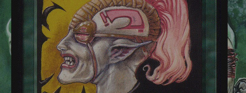
Anson Maddocks Interview
Welcome to our MTG Artists Interview series There's no Magic without art. We're very happy to share with you our talk
Read More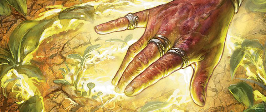
Anthony Palumbo Interview
Welcome to our Artists Interview series - There's no Magic without art - where we talk to artists about their work on
Read More