Matt Stewart Interview
Welcome to our Artist Interview series – There’s no Magic without art – where we talk to artists about their work on Magic: the Gathering. Today we dive into the incredible world of Matt Stewart, who talked about his work process, favorite paintings, and most challenging commissions to date.
You’ve been working with Wizards of the Coast for over 10 years now. Tell us a little about how you got started.
My first commissions for Wizards of the Coast were book covers for the “Forgotten Realms” line of novels, “The Knights of Myth Drannor” series, by Ed Greenwood. I guess I did a good enough job on those to catch the eye of Jeremy Jarvis, who was the art director for Magic at the time because he then offered me my first card commissions. I’ve been doing work for Magic ever since.
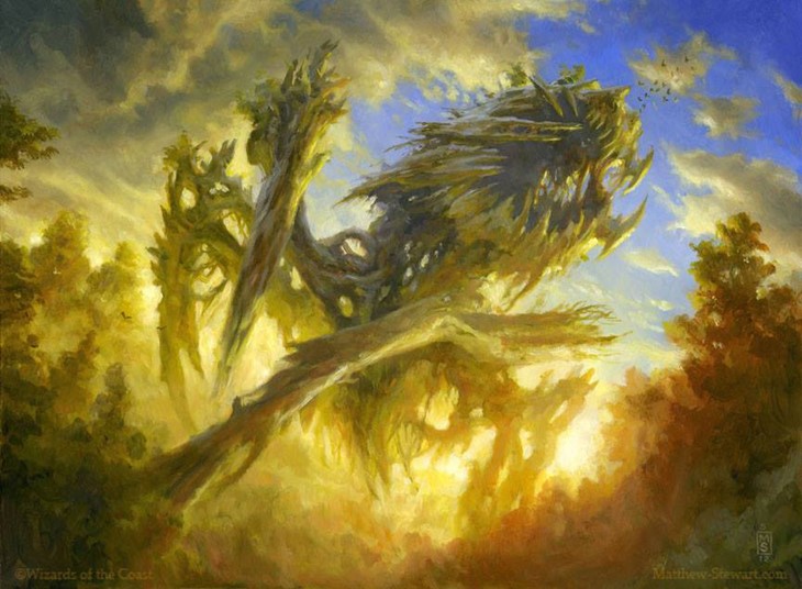
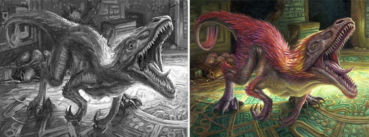
You’ve mentioned, about Woodborn Behemoth, that you “needed to give this creature something to do so that it looked alive. So [you] made it going after a flock of birds with its gigantic maw. The birds are lost when the image is reduced to card size”. How does the small card format condition the creative process, considering details are often lost?
Thinking about how an image will appear at card size is one of the most important factors to consider. Subjects must pop off the background and be clearly seen. A strong silhouette, along with proper handling of values (light and dark) enables a figure to stand out against the background.
In the case of “Woodborn Behemoth”, it’s the silhouette of the creature, the jagged design of the maw and the legs, and the contrast against the light sky that makes the illustration work at card size. The birds are a nice storytelling detail, but they’re not essential for the reading of the card.

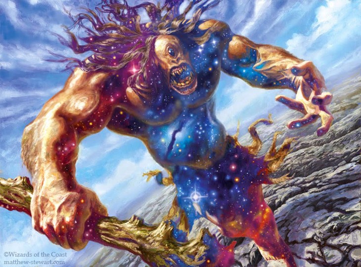
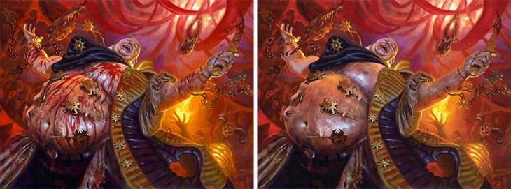
You work mainly with Oil Paintings and taught yourself digital painting too. When painting Cyclops of Eternal Fury, you started in oil and continued in Photoshop. Can you give a brief description of your work process, and the impact that digital painting had on your work?
My first attempt in oils wasn’t correct. I thought the star field would be seen in all the shadows in the image, not just the creature, which was wrong. I was probably up against the deadline at the time too. Making a nice oil painting had to take a backseat to get the star-field effect right, and getting it done on time.
The use of Photoshop isn’t used just for changes and has always been part of the process. I start with small thumbnail sketches done in my sketchbook, usually on toned paper. Then I scan the sketches into Photoshop and play around with them, trying different versions, adding more values, and building up the image until I feel I have what I need. For a long time I’d do a comprehensive line drawing, but lately, the digital versions of the sketch have been sufficient enough for me to hand into Wizards. Digital sketches also allow me to think more in value than in line. More problems are tackled in the sketch stage than in the final. When the sketch is approved, I trace the sketch onto a primed board and begin painting.
For the card Act of Treason, you “looked at a lot of pictures of Hindu festivals, where some skewer their flesh, even hanging weights on them in displays of faith and mind over matter”. Do you often research for reference?
I research for reference all the time. Even when the overall design has been established, I try to supplement my reference with information from the real world to add a greater feeling of reality. With “Act of Treason”, I went a little too real, adding a lot of blood, which was a bit too much for the card, and had to remove it.
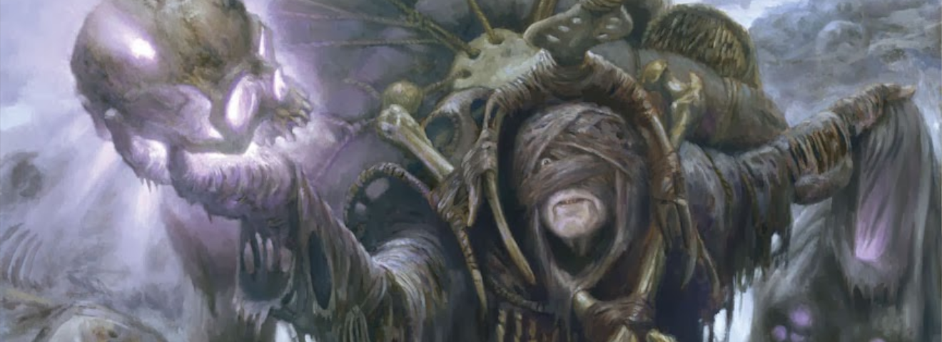
Art descriptions give artists a breakdown of the card, they must imagine it and bring it to life. Would you share with us some of your most challenging commissions?
Images with a lot of visual glowing magic effects sometimes give me trouble because they involve balancing a lot of competing or unnatural light sources. But I think one of the most challenging images to translate visually in a realistic way that comes to mind was “Mystic Barrier”.
It called for an old mage walking past a line of charging soldiers. The mage was holding a torch that emitted a wall of glowing magic that created a barrier that the soldiers could not pass. The barrier would only be seen in the smooshed faces of the soldiers as they slam into the barrier. Some would be shown knocked down, and some stopping in their tracks seeing their comrades being repulsed by what appeared to be mere smoke.

You also painted the art for Waste Not, a card created by the Magic Community. How did it feel to work closely with the players on this one?
It was an honor for me to be chosen for such a commission. I meant that the art directors had enough faith in me in a spotlight where the entire process would be public. I had to come up with three versions of an image, any of which was good enough to be on a card. I was a little hesitant to look at the online feedback, but most of it was positive, and the fans picked the one I wanted to paint, and I think I got one of my favorite images from it.

For our last question: of all the cards you’ve made, which ones do you like the most, and why?
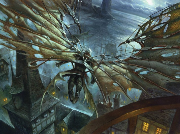
“Waste Not” is one of my favorites as I mentioned. I was very happy with the way “Cobbled Wings” turned out because of the moonlight, and the design of the wings, which was my own. I think my favorite cards are portraits though. Especially when I can think about whom this person is that I am painting, and imagine a backstory.
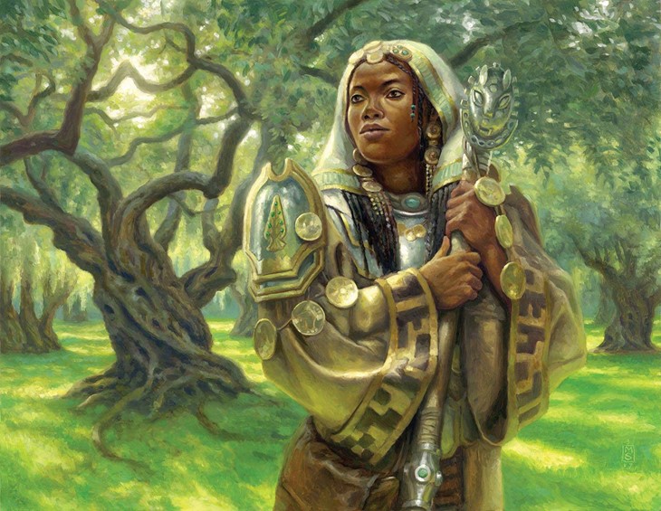
Then I can go beyond the art description, and go after a specific likeness I might want, a particular facial expression, and details that give clues to that person’s life. The devilish grin and the prison tattoos on the “Nephalia Smuggler” are examples of this. A recent favorite of mine is “Noble Hierarch”, which depicts the guardian of an olive grove in Bant.
I imagined the woman is the daughter of the old man I painted for “Honored Hierarch”. The trees have grown a bit bigger, and she wears robes emblazoned with the same symbols and has inherited his staff.
We want to thank Matt for his time and friendliness. You can read more about Matt’s work on his website, where you can get a signed print or an original drawing.

Welcome to our Artist Interview series – There’s no Magic without art – where we talk to artists about their work on Magic: the Gathering. Today we dive into the incredible world of Matt Stewart, who talked about his work process, favorite paintings, and most challenging commissions to date.
Recommended Posts
Adam Paquette Interview
Welcome to our MTG Artists Interview series There's no Magic without art. For this week's interview, we talked with Ad
Read More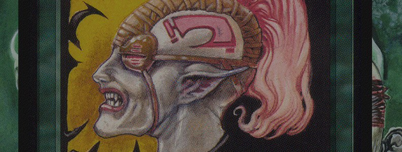
Anson Maddocks Interview
Welcome to our MTG Artists Interview series There's no Magic without art. We're very happy to share with you our talk
Read More
Anthony Palumbo Interview
Welcome to our Artists Interview series - There's no Magic without art - where we talk to artists about their work on
Read More